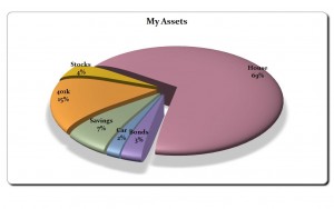
When you need an easy visual presentation of data, many graphs and charts can be used. However, one of the most useful for business and personal data is the pie chart. This type of graph presents a quick overview of data that would normally be shown in a small data table. It can be used for nominal or ordinal data. Since it’s in the shape of a pie, it’s easy to use a pie chart to show proportional data or percentages of categories.
How to Use this Pie Chart Template
This template is free and easy to use. Once you have downloaded it, you can customize it to your needs. It’s easy to follow along.
In the far left column, rename the field “Asset Type” to your own unique description. Then update the “Amount” field. The first column is the descriptive column while the second column provides the numerical data to be reviewed.
If you need to add additional rows, simply type them in below the current data. The pie chart will update automatically. It’s not recommended to represent more than seven pieces of data.
Tips for Using the Pie Chart Template
- As you can see, this pie chart is an exploding three dimensional chart of which you can call out specific pieces of data.
- If you prefer, once you have clicked the chart, you can change the type of graph displayed. In the design menu, you’ll find other design chart options that automatically update your chart.
- Click in the chart title and type in the name of your chart.
- If you right click on the chart, you can select the option “Format Data Labels”. Here you can change the labeling options to include the percentages, values, and where you would like the positioning of the labels to be placed.
- You can change the color of the pie by selecting each slice and updating the fill color for each.
The Pie Chart Template found at myexceltemplates.com is a great way to insert charts and data into PowerPoint presentations, newsletters, business plans and more.
Download: Pie Chart
Check out this offer while you wait!

