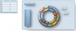
With Microsoft Excel, creating a graph or chart using powerful yet easy to use tools can be done in a snap. The number of different kinds of charts that Excel can create is staggering, and allows users to display information in numerous beautiful ways. The Excel Donut Chart is a newer chart tool that enables a user to show information graphically in the shape of a donut. If you need to view topics from multiple frames of reference, an effective way to do it would be to use our free Excel Donut Chart.
Using the free Excel Donut Chart Template
With the chart template, you’ll find easy to compare a series of tasks and the smaller parts that make up those tasks. The smaller parts usually consist of certain employees’ performances and can be put into numeric form to be measured by the donut chart. This way, we can easily compare the performances of all employees and analyze them. To begin using the chart template, read the steps below.
- Look at the task table on the left side of the spreadsheet. In this example, it stores hours worked for each employee listed.
- Change the hours in the table to match ones in your set of data.
- After changing values in the data table, you’ll see that the donut chart automatically updates.
Tips for the Excel Donut Chart Template
- To change the colors in your chart, click the Design tab in the Chart Tools section of the ribbon. There are many color combinations available, so choose what works best for you.
- In the tasks table, rename each task. This will help you properly describe each job that is being displayed in the chart.
- Add columns to the table such as “Notes” or “Description” to store even more useful information about each task.
- If you want to display information from a different table in the chart, right click the chart and click on “Select Data.” The dialog box that follows will help you choose what table your donut chart data is being pulled from.
Download: Excel Donut Chart Template
Check out this offer while you wait!

