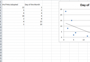
Trendlines, more specifically, “Moving Average Lines” are a great visual aid that can bring your report to the next level of professionalism and help you analyze important data that would otherwise go unnoticed. One of the most used Trendlines is the “Linear” and “Moving Average” Trendline. The Linear Trendline is useful when creating a straight line that is meant to display a specific formula that perfectly fits all the data points from your given information. Trendlines are an extremely useful tool for any business that wants a cheap and efficient way to predict sales figures beyond their indicated data charts.
Steps to Create Trendlines in Excel
Before you begin, download the free file below to follow along. You can also follow the instructions by using your own spreadsheet you want to add the Trendline.
- Create your Scatter Chart graph, in Excel 2010 or above.
- Next, click on the layout tab in the Chart Tools section of the Home button.
- Then, select the “Trendline” button in the ribbon below. This will bring up a drop-down menu for you to select a specific Trendline from the list provided.
- Among the wide variety of Trendlines you can choose from, there is Linear, Exponential, Linear Forecast, Moving Average, etc.)
- Select the “Moving Average” Trendlines option.
- Repeat the first and second steps once more
- Then, click on the “More Trendlines” options.
- Make sure that the “Moving Average” option is selected.
- To the right of the “Moving Average” selection box, there will be a box marked “Period.” This is simply the amount of periods used for the average calculation of the Trendlines.
- Finally, select the number of periods you want your data trend to last. For example, if you think that you have a trend that will last 3 data points, select 3 in this box.
Now you have all the information necessary to quickly and easily predict trends.
Download: Creating a Trend Line in Excel
Check out this offer while you wait!

