

The Regional Sales Chart is a fast and simple way to keep track of sales figures for multiple different market areas that contributes to your business or organization. The template is structured for you to quickly enter your sales figures and have that data projected onto a convenient line graph to give you an overview of all this information. This template will also provide you with a better understanding of who your target demographic is and how you can adjust your business strategy to cater to that particular group of people.
Regional Sales Chart Instructions
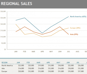
To get started simply enter the regions you want to monitor at the bottom of the page. The template lists a few global examples; however, you can change these to areas on a national scale, such as various states or cities. Simply click on any of the examples you want to change and start typing in your new information. Once you have the areas properly filled out, you just have to enter the total sales figures for each region.
The template will automatically calculate the total sales numbers from each month and give you an overview of your yearly sales figures. The chart will also give you the percentages that these regions make up of your total sales.
All this data is instantly taken from the table and sent to the line graph at the top of the screen. With this information, you will be able to analyze spikes and dips in sale trends to adjust your business strategy accordingly.
Why You Should Use the Regional Sales Chart
By using this valuable information you will gain an insight into the buying habits of your target demographic. The graph will inform you quickly about important sales information that allows you to make well-informed decisions about your business and eventually increase overall sales figures.
Download: Regional Sales Chart
Check out this offer while you wait!