

Download the example to follow along
Excel is an easy and effective way to create many different kinds of charts for presentations and assignments. Bar graphs, pie graphs, and more can all easily be made in Excel.
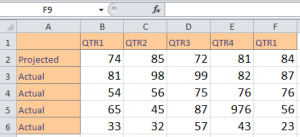
In the example you download, there are stats from 2 quarters of a business. We’ll learn to create a chart in Excel using this data.
Click anywhere in the data, such A1, then click the “Insert” tab and you’ll find a charts section:
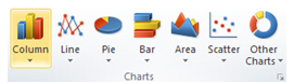
Excel has choices for line, column, pie, bar, area, scatter, and multiple other charts.
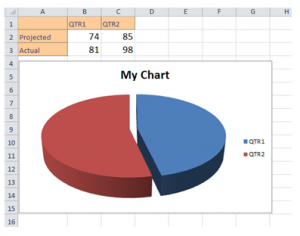
Click the chart you want (we’ll use a pie chart here). By clicking it, you can move it around and resize pieces. The default title is “My Chart”, but by selecting it you can rename it.
You’ll notice in the Excel Tool Ribbon that multiple “Chart Tools” appear when you select your chart. With these, you can change the layout and styles for your chart.
![]()
There are also three tabs – Design, Layout, and Format.
Design is the default selected. Add titles and move around elements in the layouts area, and change colors in the Styles section.
In the Layout tab, you can work with title formats, legends, and data labels.
The Format tab allows you to work with shapes and text. All of these tabs allow you to completely customize your chart to represent exactly what you need. Utilize the options to make an easy to understand and effective chart.
Check out this offer while you wait!