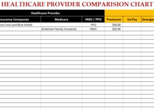
Choosing a healthcare provider is a serious business and that’s why you need the Healthcare Provider Comparison Chart at your side. This free template can help you choose between options to assist you in picking the right one. All you need to do is enter the numbers you’ve been quoted and watch the template take care of the rest. You can even enter different options for premiums, co-payments, and emergency room fees. This template does it all. If you’re ready to choose the right healthcare provider for your needs, follow the list of instructions below to learn how to download and use this free Comparison Chart.
Getting Started with the Healthcare Provider Comparison Chart
When you’re ready to download the free Healthcare Provider Comparison Chart to your computer, scroll to the bottom of this page and follow the link below.
The template provides you with a list of instructions on the first tab and a list of every major healthcare provider in the “List Name” tab.
- Start by selecting the Insurance companies/ Medicare companies and the HMO / PPO from the drop down list.
- If your provider does not appear in the list, go to the “List Name Sheet” and enter the name under the list table. It will be included in the table and auto-populate in the drop-down menu when you go back.
- Finally, enter the rates in their respective cells and compare.
This template makes it fast and simple for you to get exactly what you need. You’ll receive the clear-cut evidence that one program will be better for you than another. Using this free template, you can analyze any aspect of a company’s plan and see which one will work best for you in the end.
Download: Healthcare Provider Comparison Chart
Check out this offer while you wait!

