

Creating a Gauge Chart in Excel is a nice way to step up your project tracking game and have an effective way to analyze important information at a glance. A Gauge Chart or “Speedometer Chart” serves as a visual aid that combines the functionality of a Doughnut and Pie chart to give you a clear view of your total progress for any goal, project, or activity that you might be organizing. Unfortunately, Microsoft Office doesn’t offer a Gauge Chart as one of the default options listed in the “Insert” menu but don’t despair. You can easily make one by following the list of instructions below.
How to Make a Gauge Chart in Excel: Steps
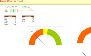
A sample template is provided at the bottom of this page to illustrate what a Gauge Chart looks like and how it functions. Click the link to download the template for free.
- You’ll first need to select your range. Simply highlight cells H2:I6
- Once you have your range selected, click the “Insert” tab at the top of your screen.
- Click the “Other Charts” button and choose the “Doughnut Chart” option from the list below.
- Next, you will enter your data points into the range you highlighted earlier, with the 4 point series representing your Doughnut Chart and the 3 point series as your Pie Chart. You’ll want to change your fills for both charts to “Solid Fill or No Fill” in the “Format Selection” table of the “Format” tab at the top.
- Select your Doughnut series first, then click “Format Selection” to change your angle to 270 degrees.
- Now you can select your chart. Right-click and select “Format Chart Area” to change the preset options to “No Fill” and “No Line”.
- The final step is to remove your legend by clicking on the legend.
Now you have everything to need to keep track of your project’s progress by using the Gauge Chart feature.
Download: How to Make a Gauge Chart in Excel
Check out this offer while you wait!